I'm taking a Typography course this semester which is very intense in a good sort of way and it is giving me loads of appreciation for basic and complex font forms. I'm not supposed to seek inspiration online for the class (the teacher advocates seeing type in its physical form--magazines and books)...but we all know I am an Internet junkie.
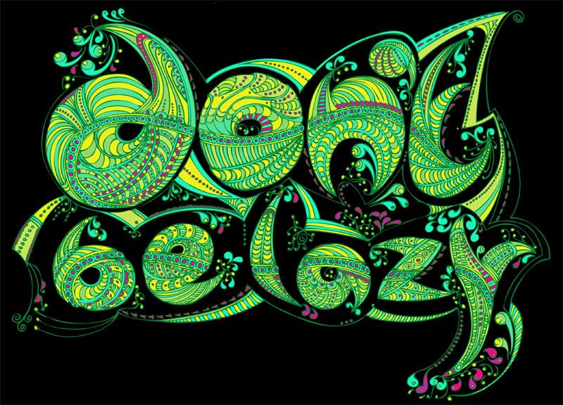
I'm in love with Nikki Farquharson's ornate words. (P.S. I posted on some of her other work before.) 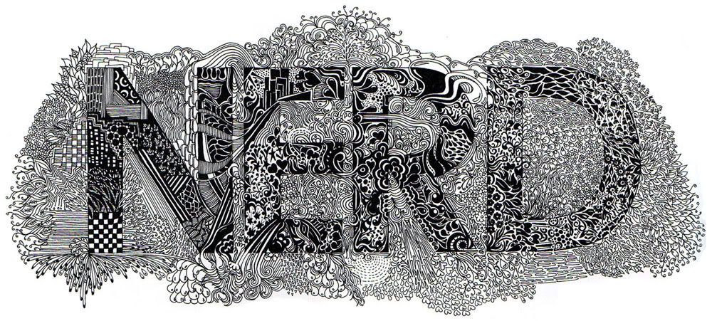
This wall was created in the 1960s by Lou Dorfsman of CBS is absolutely amazing and only recently saved and restored. It contains more than 1,450 letters and is full of random (?) food imagery.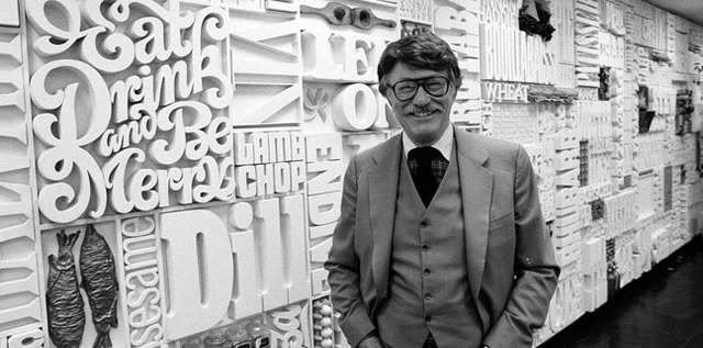
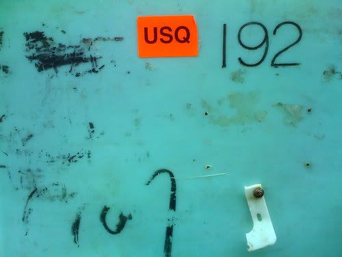
The Journal of Urban Typography is a tumblr account that showcases pictures of urban signs that are created for purely utilitarian reasons. Some of the signs are really quirky and wonderful, while others are beautiful in their simplicity and striking colors.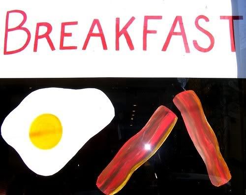


0 comments:
Post a Comment